Communication
When teaching complex business concepts, it’s easy to prioritize the instructional content itself. However, equal attention must be given to how that content is communicated throughout the course. This involves not only using clear wording and effective formatting to help students understand and process new information but also addressing the tone and inclusivity of your communication. These elements shape the classroom environment, fostering a space that is both welcoming and conducive to learning.
Syllabi, assignment instructions, email announcements, course slides, and other instructional materials are all parts of the student experience where careful communication can have a meaningful impact. Typically, Brightspace is the central repository for many of these forms of communication. Unclear or inaccessible communication can impede student learning and participation.
The strategies in this section aim to avoid those pitfalls by enabling clear communication, with a focus on writing style, tone, and understandable visual design:
Writing and tone
Clear, concise writing is essential for removing barriers to understanding, especially when students come from diverse backgrounds with varying levels of familiarity with business concepts. If our writing is overly complex, filled with jargon, or assumes knowledge that some students may not have, we risk losing their interest or leaving them confused. To promote student engagement and comprehension, consider these principles:
Clarity: Use simple language and straightforward structure. Avoid unnecessary jargon, and when technical terms are needed, make sure they are well-defined.
| Inelastic demand pertains to a situation wherein the proportional variability in the quantity demanded is demonstrably negligible in response to fluctuations in price, thereby indicating an almost static consumer behavior despite monetary perturbations. | VS | Inelastic demand occurs when the quantity demanded changes very little in response to a change in price. This means consumers keep buying about the same amount, even if the price goes up or down. |
Conciseness: Avoid wordiness and communicate your main ideas directly.
| In recent years, many institutions within the banking industry have expressed, through various public statements and formal reports, their strong desire and clearly stated intention to establish, promote, and implement a comprehensive regulatory framework for the management, oversight, and governance of cryptocurrency and digital assets. | VS | Recently, many institutions within the banking industry have publicly expressed their strong desire to implement a comprehensive regulatory framework around cryptocurrency and digital assets. |
Conciseness and clarity often go hand in hand. Direct language trends toward shorter constructions and simpler word choices. And by removing redundant language and filler words, your central idea becomes more prominent and, thus, clearer.
Tone: Your tone can significantly influence student motivation. A warm, encouraging tone fosters a supportive learning environment, making students more comfortable asking questions and participating in discussions.
Using a conversational tone or second-person perspective can be an effective choice–don’t hesitate to try it.
Late submissions are taken seriously in this course. Students who submit an assignment late for the first time after the due date in Brightspace will face a 20 point (or 50%) deduction to their grade for that assignment. Students who submit an assignment late a second time will receive a zero. NO EXCEPTIONS WILL BE MADE FOR LATE WORK!!! REVIEW THE GRADING POLICY HERE FOR MORE. | VS | The first time you submit an assignment late you will lose 20 points (or -50%) on that assignment. Thereafter, no late work is accepted. For more information see my grading policy. |
These guidelines may seem simple to follow, but applying them consistently requires careful attention.
Keep these considerations in mind across all aspects of your course, from announcements to assignments and assessments. For example, when drafting email announcements to students, using inclusive and motivational language helps create a positive learning atmosphere. When writing grading guidelines, consider using a supportive tone over an inflexible one.
Existing resources
There is a wealth of resources to write more effectively. We’ve included some of our favorites below, with a focus on clarity, conciseness, and tone.
- "Writing Concisely" from the Writing Center at UNC-Chapel Hill - This handout follows its own advice, homing in on a few specific, actionable pieces of guidance.
- Strunk and White, The Elements of Style - This classic has long been a fixture on writers’ desks across several industries. Though it includes some anachronisms, it still features plenty of relevant advice.
- George Orwell, Politics and the English Language - This famous essay takes aim at the linguistic excesses of political communication. (Though academia can be guilty of many of the same sins.) Short and emphatic, this essay is not as comprehensive as other guides, but it is filled with striking examples and a few clear rules to remember.
- "Writing Concisely — the Paramedic Method" - From Richard Lanham (Revising Prose), Purdue University Online Writing Center
- "Concision" - Joseph M. Williams, Style: Toward Clarity and Grace
Syllabus Refresh Workshop
This workshop, produced by the NYU Stern Learning Science Lab, has a more modest scope than Orwell or Strunk and White: improving your syllabus. In addition to advice on language and tone, it provides guidance on what to include and how to talk about challenging new concerns like AI use in class. You can view the slides or a recording of the workshop.
Visual design principles
PowerPoint slides are an essential tool in many classrooms, particularly where complex data and ideas need to be communicated clearly and efficiently. However, the quality of a slide’s design significantly impacts the effectiveness of a lecture or presentation. Thoughtful visual design clarifies concepts and enhances learning, while poorly designed slides can distract students, overload them with information, and hinder understanding.
Whether you’re preparing a lecture on financial modeling or organizational behavior, these guidelines will help you craft slides that complement your teaching and support student learning.
These principles aren’t limited to teaching. Many of them promote clear, effective communication in any context, and they can be invaluable for students in their assignments and presentations.
Text content
Whitespace
Whitespace (or “negative space”) isn't empty—it's a crucial design element that gives content room to breathe. Within documents, paragraph breaks, columns, and other layouts are designed to use whitespace in ways that maximize reader comprehension.
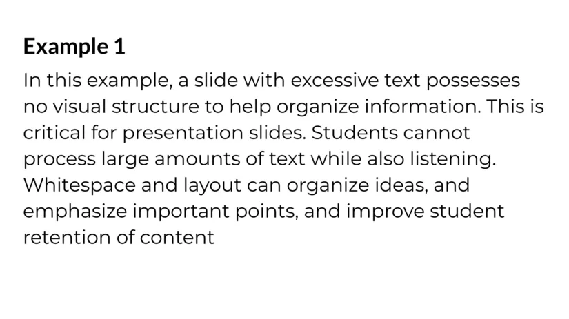
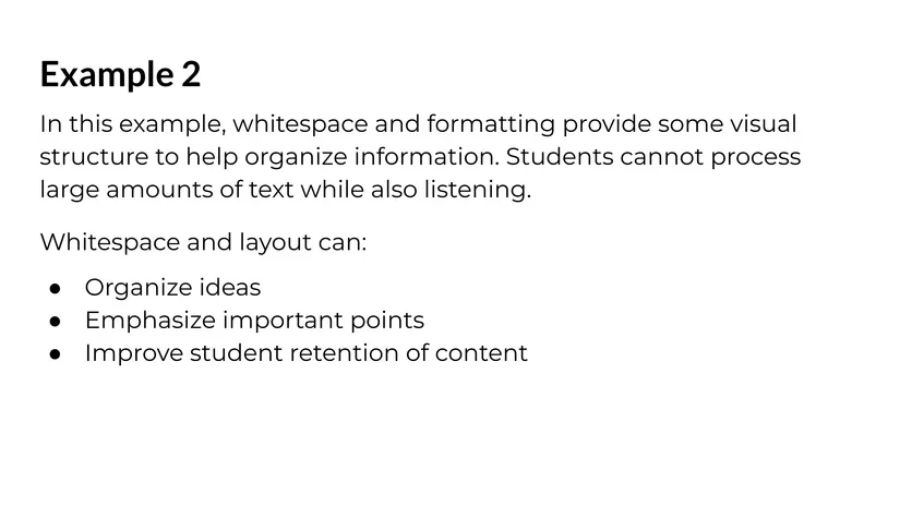
If you are creating your own slides, however, you are often responsible for your own layout. And when slides are too dense with text, students struggle to identify key points and relationships between concepts. Whitespace allows students to focus on the essential points, promoting clarity and improving recall.
To use whitespace effectively, avoid overcrowding slides with text. Focus on key points and leave space around them so that students can easily digest each idea. Even on slides that feature only text, remember to utilize familiar tools from document formatting such as paragraph breaks, spacing, bullet points, and multi-column layouts. Think about when it makes sense to break up slides.
| 
|
Headings and subheadings
Just as we structure our lectures with clear organizational patterns, our slides and handouts should reflect a clear visual hierarchy. Large headings, subheadings, and body text should be visually distinct, helping students quickly grasp the content’s organization.
A well-defined visual hierarchy helps students process and prioritize information. Headings and subheadings should guide the audience through the structure of the content, signaling transitions between major and minor points. This can be accomplished by using distinct font sizes, boldness, and consistent positioning on the slide.
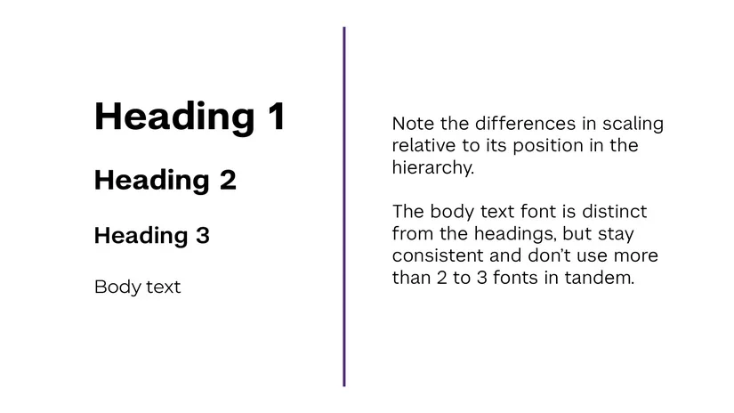
For headings, the relative differences in size and weight communicate the hierarchy of information. The specific sizes you should use depend on the format, but here are some general recommendations:
Web and digital documents | Presentation slides | ||
| Heading 1 | 16-18 pt | 24-32 pt | 36-44 pt |
| Heading 2 | 14-16 pt | 18-24 pt | 28-36 pt |
| Heading 3 | 12-14 pt | 14-18 pt | 24-28 pt |
| Body text | 10-12 pt | 11-14 pt | 18-24 pt |
These visual elements impact how readers process text, but in digital formats like web pages, Word documents, and PDFs, correctly using headings and subheadings doesn’t just change how headings look. These text styles include metadata with consequences for assistive technologies like screen readers, which we will discuss in the Digital Accessibility section.
Typography
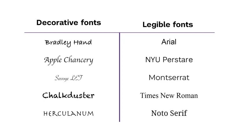
Font choice isn't merely aesthetic—it directly impacts readability and, by extension, learning. Select fonts that are clear and legible, even from the back of the room.
It can be tempting to try to spice up what might seem like visually uninteresting material with more exciting colors and fonts. If these additions are superficial, however, then they do not change the underlying content and can, in fact, impair student understanding of it.
Avoid overly decorative fonts and ensure consistency throughout the presentation.
Text case
“Case” refers to capitalization. Some common cases include:
- “ALL CAPS,” where every letter is capitalized
- “Title Case,” where every major word is capitalized
- “Sentence case,” where the first letter of each sentence is capitalized
- “lower case,” where no letters are capitalized.
For headings and titles, Sentence case or Title case is preferred. Avoid “ALL CAPS,” as it can impair legibility, especially for longer titles.
Text alignment
Text alignment and justification affect the readability of your slides. In English, left-justified text is generally easier to read, as it provides a consistent starting point for each line and consistent spacing between words, reducing cognitive strain.
While justified text might look neat—and it is useful for more complex layouts—it can create irregular spacing that disrupts reading flow. It should not be used for long passages.
| Justified text offers a consistent width that can be especially useful in complex layouts. However, it results in irregular spacing between words, hampering readability for longer texts. | Left-aligned text maintains a consistent starting point for each new line, improving readability. |
Slides and graphics
Slides are frequently used in the classroom, and as a visual medium, they provide the opportunity to incorporate visual design techniques into your teaching. Incorporating the following principles into your slides and graphics will help ensure they serve as teaching aids that truly make material clearer for your students.
Iconography
When properly implemented, icons can serve as visual anchors that help students quickly identify and remember key concepts. They should represent concepts in a simple and intuitive way, adding to the overall understanding of the content rather than serving as decoration.
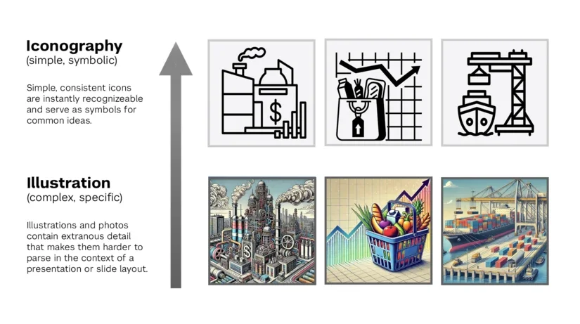
However, be cautious: Icons must be consistent and immediately recognizable to be effective. Too many icons or complex images can confuse students or cause unnecessary distractions.
Visual design
Gestalt principles
Gestalt principles describe how people perceive different visual elements and how they combine and relate to each other to create additional meaning in a design or layout. Gestalt principles are leveraged by graphic and visual designers in many fields, but a basic familiarity with them can also help you ensure that your teaching materials are being interpreted as you intend. There are a large number of Gestalt principles. We’ll look at a few here that can aid in the design of slides and teaching materials—in particular: proximity, similarity, and common region.
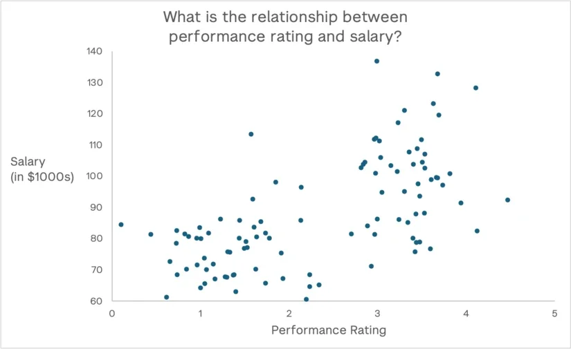
Proximity: Elements close together are perceived as related. This can impact slide layouts where, for example, putting different categories together may imply an association between them.
A data visualization like a scatterplot leverages this principle, by placing data points with similar values in close proximity to each other, making it easier to differentiate potential groups.
Similarity: Similar elements are perceived as part of the same group. Similarity can be based on characteristics like size, color, shape, etc. In the example below, everything is spaced evenly, so Proximity isn’t a relevant cue, but groups are still clearly distinguishable by brightness.

Common region: A closed region can also be used to communicate a separate grouping.
Understanding and applying Gestalt principles helps create slides that align with natural human perception patterns. The principles mentioned on this page are especially useful in the context of instruction, as they often have an impact on how viewers will interpret a slide layout, whether intentional or not.
Mayer's principles
Whereas the Gestalt principles have their origins in broader psychological and cognitive theory, research has been conducted into the effect of visual and media design on teaching and learning. Some of the most prominent research in this area has been conducted by Richard Mayer.
Mayer’s 12 Principles of Multimedia Learning provide a strong framework for integrating visuals and text to enhance learning. Many of these principles apply to formats that include both an auditory and a visual channel, such as video with narration or a live presentation where you are speaking to slides. If Gestalt principles largely center around the way a viewer will group, compare, or complete different elements, then Mayer’s principles are complementary. They focus, in large part, on minimizing cognitive load and focusing viewer attention to the most relevant part of a larger image or design.
As with the Gestalt principles, there are many principles that are worth reviewing in full. But below, you can see some of the principles most pertinent to slide and handout design.
Coherence: Eliminate extraneous material. For example, decorative images may seem like they add more interest to an image, but if it’s not relevant to the content, then “interest” just as often acts as distraction. Another common trap is including excessive labels or text.
Context is key here. A large dataset may be convenient to reference, but it can often bury the most relevant information for your specific point. Below, the map on the left contains a lot of extraneous detail if you’re primarily concerned about a comparison between two specific countries:
| Violating principle: | Adhering to principle: |
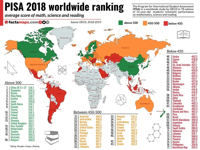
| 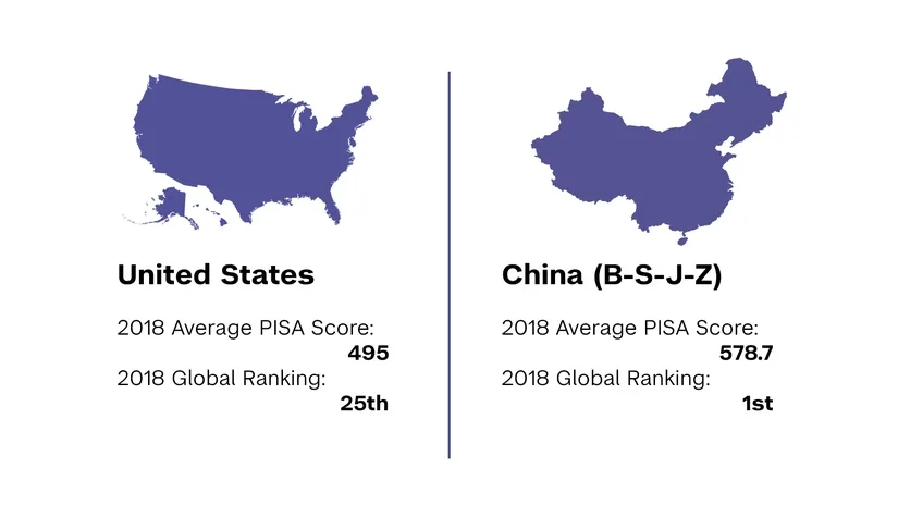
|
Signaling: Highlight essential material. In a video or presentation that moves at its own pace, students’ attention is better spent on the content itself than on searching for the relevant part of a slide or diagram. This can also help mitigate issues caused by extraneous details when you cannot find a visual that adheres to the Coherence principle.
| Violating principle: | Adhering to principle: |

| 
|
Redundancy: Don't present identical information in multiple formats. The most common way this shows up in teaching is when your slides contain lengthy text that repeats what you’re already saying.
Consider using Speaker Notes in your slides so you and your students can reference your commentary without cluttering the visuals.
| Violating principle: | Adhering to principle: |

| 
|
Spatial Contiguity: Place related elements near each other. This often includes elements like labels and descriptions. Spreading related information far apart requires students to expend more of their attention decoding the image.
This frequently comes into play not just in slide layouts, but in individual illustrations and data visualizations. In a graph, for example, labels should be located alongside the data they reference.
| Violating principle: | Adhering to principle: |

| 
|
These principles are supported by extensive empirical research showing significant improvements in learning outcomes when applied correctly (Mayer, 2009).
While mastering slide design principles requires effort, the impact on student learning makes it worthwhile. Start by implementing one or two principles in your next presentation, and gradually incorporate more as you become comfortable. Remember that the goal isn't to create visually stunning slides, but rather to use visual design strategically to support and enhance student learning.
Consider doing a quick self-audit of your slides using these principles. Are your text elements clearly hierarchical? Do your graphics support learning or distract from it? Is your layout in alignment with Mayer’s principles? Small improvements in these areas can lead to significant gains in student comprehension and retention.
Additional resources
- Improving your slide decks workshop - The Learning Science Lab has produced a workshop that discusses applying many of these principles in the context of presentation slides. Check out the workshop slides or view the full recording.
- LSL Slide Feedback Tool - Looking for feedback on a specific design? We’ve created a ChatGPT-based Slide Feedback Tool you can use. Here’s how it works: you can copy and paste an image of your slide layout. The tool will analyze the image and offer feedback based specifically around teaching and learning concerns like accessibility and Mayer’s principles. It’s a great way to brainstorm improvements to a challenging design.
Conclusion
Effective communication involves more than just knowing your subject well—it requires careful attention to how you present the material. Clear, concise writing and an appropriate tone make content more accessible, while accessibility features in digital learning environments ensure that all students have equal opportunities to engage with your course.
These strategies don’t require extensive extra work, but they do require intentionality. By building these habits into your teaching practice, you can create a more inclusive and supportive learning environment where all students can succeed.
References
- Mayer, R. E. (2009). Multimedia learning (2nd ed.). Cambridge University Press.