Digital accessibility
Ensuring digital accessibility is not just about accommodating students with documented disabilities—it is about providing equal access to learning materials for all learners from the outset. This principle, often referred to as Universal Design for Learning (UDL), encourages flexible engagement with content, multiple means of demonstrating knowledge, and diverse ways to stay motivated.
In online learning environments, where technology mediates interactions, creating content with accessibility in mind is even more important. Most software has features that help enable accessibility, either directly within the platform or by enabling the use of assistive technologies like screen readers. But those features will only work properly if you create content in ways that support them.
Below are key accessibility best practices, along with implementation guidance across common software applications.
- Headings
- Fonts and colors
- Alt text
- Descriptive links
- Captions
- Representation and inclusivity
- The benefits of accessibility
Headings
In Communication, we discussed how headings create a visual hierarchy for readers. But what about students who are visually impaired?
In most software, headings contain semantic in addition to visual information. Avoid using bold or font size alone to indicate headings—always use built-in heading styles, so software like screen readers can parse the structure of a document or create an automatic document outline.
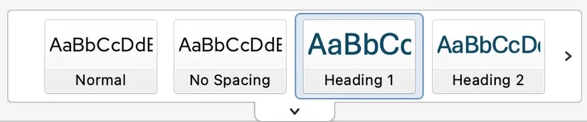
The “Styles” panel in Microsoft Word
- Microsoft Word: Apply heading styles via the "Styles" panel (Heading 1, Heading 2, etc.).
- Google Docs: Use built-in heading styles found under "Format" > "Paragraph styles."
- Microsoft PowerPoint and Google Slides: These presentation tools don’t support a full heading structure, but every slide should have a descriptive, unique title.
- PDFs: Ensure the source document includes properly formatted headings before converting to PDF. Use Adobe Acrobat’s "Tags" panel to confirm structure.
- HTML & Rich Text Editors: When working within platforms like Brightspace, use the editor's built-in heading options rather than manually adjusting font size or bolding text.
Fonts and colors
Readable fonts and sufficient contrast are essential for accessibility. Decorative or script fonts can be difficult to process, particularly for students with dyslexia or visual impairments. Low-contrast text (e.g., light gray on white) poses readability issues for users with low vision or color blindness.

- Microsoft Word & PowerPoint: Choose sans-serif fonts such as Calibri, Arial, Lato, or Montserrat. Check color contrast with PowerPoint’s built-in Accessibility Checker.
- Google Docs & Slides: Stick to clear, readable fonts and verify contrast using add-ons like "Grackle Docs."
- PDFs: Ensure contrast is adequate before exporting. Adobe Acrobat includes tools for verifying contrast levels.
- Other Platforms: You can use a contrast checker to assess compliance.
Alternative Text (Alt Text)
Be careful about using images for content like extensive text or tables. Where possible, if content can be represented with an application’s native features, it will be more accessible to use those. But when your only option is an image, alt text ensures the content will remain accessible.
For example, this image of a table may look fine, but a screen reader cannot access its contents, and it would require extensive alt text to capture everything it conveys.
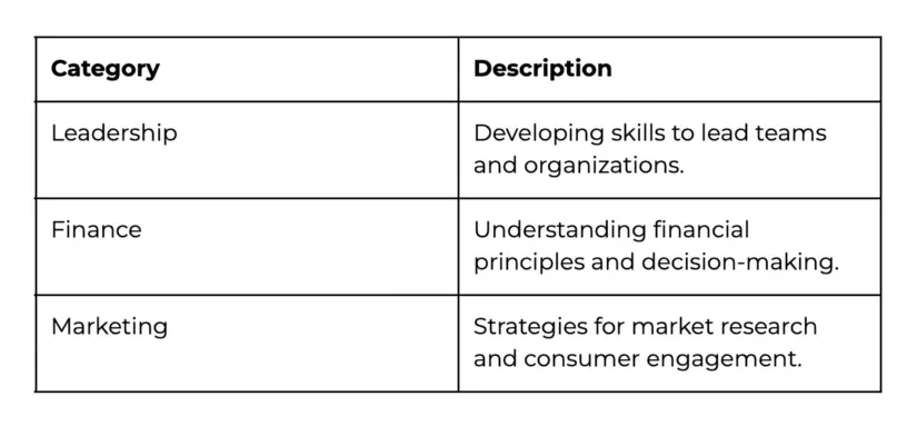
A table built within the platform–in this case, an HTML web page–might look similar at first glance. But you’ll notice you can highlight the words with your mouse, and a screen reader would be able to read the text.
| Category | Description |
|---|---|
| Leadership | Developing skills to lead teams and organizations. |
| Finance | Understanding financial principles and decision-making. |
| Marketing | Strategies for market research and consumer engagement. |
For non-text data, images often are appropriate. In these cases, alt text provides a textual description so individuals using screen readers can understand visual content. It is especially critical for complex visuals like charts and graphs. Alt text should be concise and informative, avoiding redundancy while conveying key details.
- Microsoft Word & PowerPoint: Right-click an image, select "Edit Alt Text," and enter a brief but descriptive summary.
- Google Docs & Slides: Right-click an image, choose "Alt text," and provide an appropriate description.
- PDFs: Use Adobe Acrobat’s "Set Alternate Text" tool to ensure images are properly tagged.
Descriptive links
Use meaningful link text rather than generic phrases like "click here." Descriptive links help all users, including those using screen readers, understand the link’s purpose without needing additional context. They also improve scannability for all readers, making documents easier to navigate.
For example, instead of using "Click here for more information," use a more informative phrase like "Read the Web Content Accessibility Guidelines (WCAG)."
- Microsoft Word & PowerPoint: Highlight the link, select "Insert Link," and use meaningful text.
- Google Docs & Slides: Right-click the hyperlink, select "Edit link," and enter a descriptive phrase.
- PDFs: Verify that exported links retain meaningful text; edit manually in Acrobat if necessary.
Captions
Captions ensure that video and audio content remains accessible to students with hearing impairments. They also support learning in noisy environments, and in supported players captions allow students to search for content within a video. You should make sure captions are available regardless of whether you’re sharing a video directly with a platform like YouTube or NYU Stream, or have a video embedded in another file, such as a presentation.
- Microsoft PowerPoint: Enable live captions using built-in subtitle features.
- Google Slides: Activate live captions in "Present" mode.
- PDFs: Ensure any embedded multimedia includes captions before converting.
- NYU Stream: NYU’s video platform offers captioning services for course materials. NYU Stream can also be used to add public YouTube videos, and then request captions.
Representation and inclusivity
Diverse and inclusive materials foster a more equitable learning environment. Case studies, examples, and imagery should reflect a variety of perspectives and experiences.
- All Platforms: Use content that represents diverse backgrounds and viewpoints. Avoid stock imagery that lacks diversity or reinforces stereotypes.
The benefits of accessibility
Making content accessible is often about leveraging built-in tools efficiently. A common refrain when discussing digital accessibility is that it benefits all users, not just those who require assistive technologies. While this is true, it underplays another benefit: rather than adding work, it can make things more streamlined for you, the content author.
Formatting documents properly and incorporating good design allows you to leverage tools as they were designed and results in content that is faster to create and easier to maintain.
And for those accessibility requirements that do involve extra work, like alt text and video captions, recent advances in AI have made them vastly easier to include than they were just a few short years ago.
Finally, remember that many programs have Accessibility checkers that can help make sure you don’t miss anything important. Word, PowerPoint, and Brightspace have them built in. Google Docs and Slides support accessibility checks through add-ons like Grackle Docs.
You can download or print this Digital Accessibility Cheat Sheet for quick reference.